

In part 1 we saw how to start our project.
Now it's time to create a first visual draft of our list.
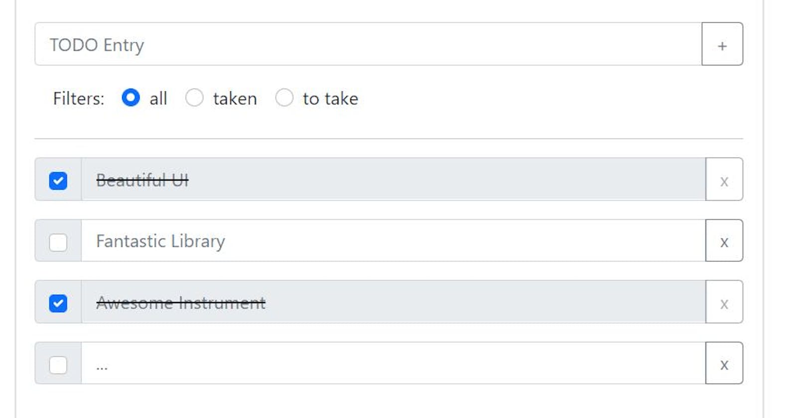
Trying to imagine this list in the most basic way, we'll surely have at least a textual input to insert the items, with an associated submit button, a simple filter to choose which items to display, and, indeed, our list.
We can think of the list as a series of inputs similar to the insertion one (thinking of some kind of element modification mechanics) with a checkbox on the left (to mark the completion of the element) and a button for its deletion on the right.
A "taken" element could be strikethrough and could have the text input and delete button disabled.
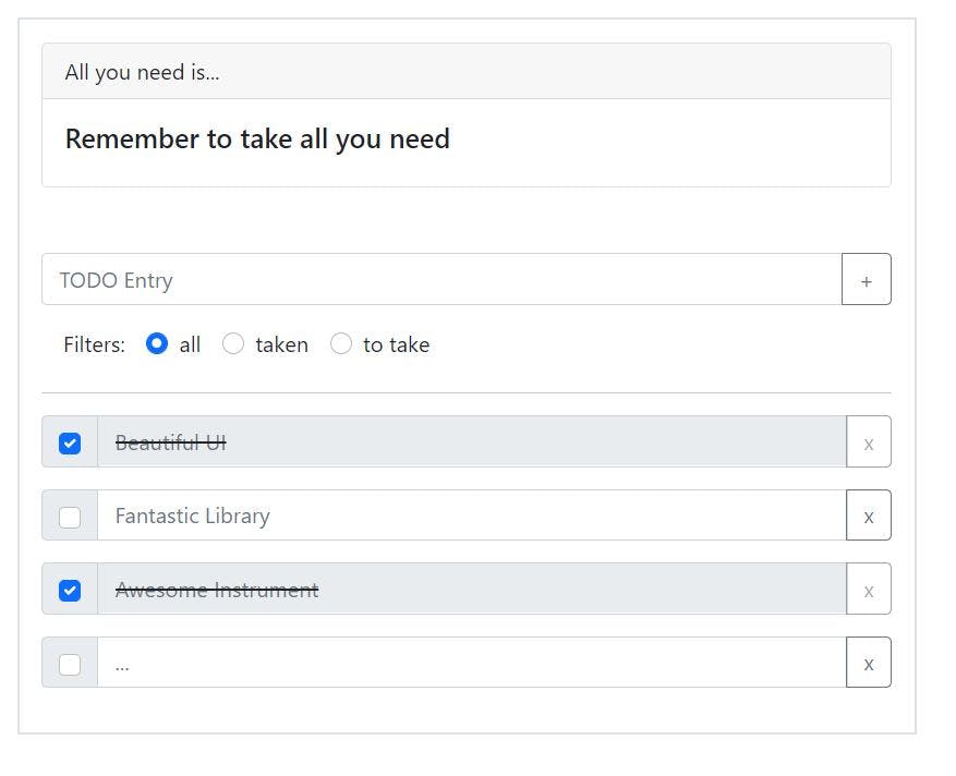
Let's put a card with title and subtitle at the top.
At this point we can open our App.js and start creating the useful components (in a single file for now).
We start by creating the title card:
const TodoListTitle = () => {
    return <Card className="mb-5">
        <Card.Header>All you need is...</Card.Header>
        <Card.Body>
            <Card.Title>Remember to take all you need</Card.Title>
        </Card.Body>
    </Card>;
}
We then move on to the input to insert new elements. This will have a textual input and a button, all in an input group:
const EntryInput = () => {
    return <InputGroup className="my-3">
        <FormControl placeholder="TODO Entry"/>
        <Button variant="outline-secondary">+</Button>
    </InputGroup>
}
We create three filters (all, taken, to be taken):
const ListFilters = () => {
    return <div className="mb-3">
        <Form.Label className="mx-3">
            Filters:
        </Form.Label>
        <Form.Check
            inline
            type="radio"
            name="list-filter"
            label="all"
            checked
        />
        <Form.Check
            inline
            type="radio"
            name="list-filter"
            label="taken"
        />
        <Form.Check
            inline
            type="radio"
            name="list-filter"
            label="to take"
        />
    </div>
}
A divider to indicate the beginning of the list:
<hr/>
A few items to see the effect of setting up this list. Each element will be an input group with a checkbox, a text input (editable or locked based on its state), and a button for deleting the element from the list:
const EntryItem = ({title, completed = false}) => {
    return <InputGroup className="mb-3">
        <InputGroup.Checkbox checked={completed}/>
        <FormControl disabled={completed} placeholder={title} className={completed ? 'text-decoration-line-through' : ''}/>
        <Button disabled={completed} variant="outline-secondary">x</Button>
    </InputGroup>;

}

const EntriesList = () => {
    return <>
        <EntryItem title="Beautiful UI" completed/>
        <EntryItem title="Fantastic Library"/>
        <EntryItem title="Awesome Instrument" completed/>
        <EntryItem title="..."/>
    </>
}
Perfect!
We have our first graphic draft:
const App = () => (
    <Container className="mt-3">
        <Row className="justify-content-center">
            <Col md={6} className="border border-2 p-3">
                <TodoListTitle/>
                <EntryInput/>
                <ListFilters/>
                <hr/>
                <EntriesList/>
            </Col>
        </Row>
    </Container>
);

export default App;
In the third part do a refactor of the components dividing them each in its own file and preparing them to interact with each other and with the states of the application!
In the meantime, what do you think is needed to make this list idea more "advanced" than that? Let me know!
See you next time!